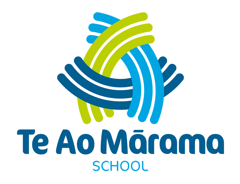
The graphic logo has been carefully designed to symbolise many positive concepts. The most apparent is that of an interconnected woven form, the concept of which is derived from the tukutuku panels.
The trio of coloured elements are all interconnected with an abstract woven pattern wherein each aspect lends and draws support from the other pieces around it. It is an important concept of supported strength and collaboration that symbolises various relationships:
- between the land, water and people
- concepts of ‘inspire, challenge, empower’
- Maori, NZ European, people of the world
- school, community, wider world
- parents, staff and students
- past, the present and the future.
The interwoven graphic also forms a loose letter ‘A’ for ‘Ao’ - the light. Similar to the way in which mountains rise from the land with a natural upwards force, the graphic represents Tāne (God of the forests and birds) pushing upwards and separating his parents, Papatūānuku (the earth mother) and Ranginui (the sky father), thereby allowing light to come into the natural world.
The clear lines and areas within the graphic shape allow ‘light’ to penetrate the logo, just as the sun illuminates and brings the new day.
The coloured lines are representative of the learning journey path: each student is on the ‘wave’ of their learning. Looking closer, these individual strands symbolise individual learners, but the overall direction is that which is heading forward together cohesively.
A further abstract concept that can be drawn is that the lines also denote the flow of water from Te Awa o Waikato, which traditionally brings life, prosperity and connectedness to both the people and the land.
A simple, fresh and vibrant colour theme has been carefully chosen to represent the natural world. Each of the colours of the logo are symbolic: light blue for sky (Ranginui), dark blue for water (lifeforce), and green for earth (Papatūānuku).